Karmakamet The Mall Bangk…
Karmakamet is a luxury fragrance boutique that expresses its brand identity through a distinctly cla…

The team around Steven Holl can also build smaller formats: On the banks of the East River in New York, the architect’s office realised a slender, cuboid building that can hold 50,000 books and captivates with its silvery facade.
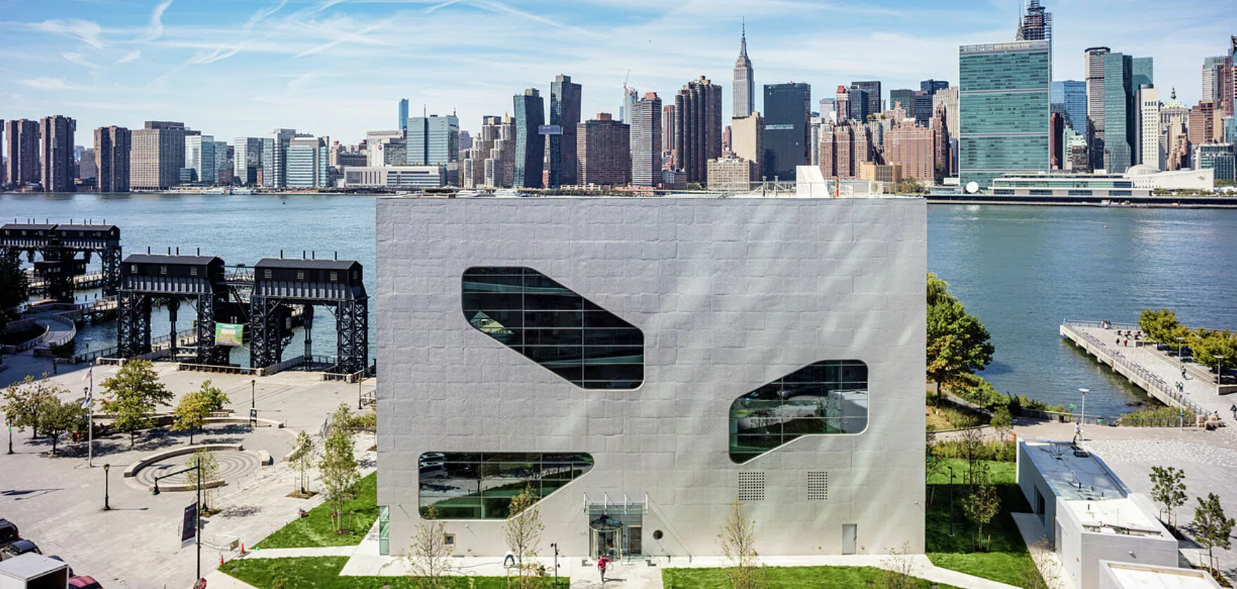
Compared to the neighbouring residential towers of Queens, the new public library at Hunters Point seems almost tiny. Nevertheless: The only seven-storey high and extremely narrow building has become a landmark. The strict basic shape of a high cuboid is opened up by cut outs and organically shaped, freely arranged glass areas. In this way, the public library clearly distinguishes itself from the grid facades of its surroundings and signals its special status. This perception is even more enhanced by the silvery shimmering on the facades.
It took about 30 years to turn the first idea into reality: A new library for Queens, not only as a source of knowledge, but also as a meeting place. In 2010, the concrete planning of the New York office of Steven Holl Architects began, the construction phase started in 2015 and finally in September 2019 the architectural highlight was officially opened. Located directly on the East River, the slim floor plan was also chosen to preserve the important urban open space of the surrounding park as much as possible.
The library differs from its neighbours in terms of construction: It is not a skeleton building with a curtain wall. Instead, the facade takes on the load-bearing function. This may sound unusual, but in this way the entire interior remains free of columns, a prerequisite for the fluid spatial program on which the concept is based. Different floor heights, half floors, bridge-like stairs, a stepped reading room, an auditorium for 140 people, digital zones and a reading roof garden provide a highly exciting and inspiring interior. Bamboo panelling makes a warm tone in the rooms, with light and functional grey nuances. Thanks to the large, shell-like openings in the facade, a lot of natural light enters the interior – and at the same time, there are breathtaking views of the Manhattan skyline on the other side of the river.
The surface of the facade shows a roughness that reflects the formats and textures of the formwork panels in their raw state. This is contrasted by the full-surface coating of the facade with Concretal-W and Design-Lasur Metallic.
The concrete shell of the building initially challenges European architectural habits: It does not follow the ideal of a fair-faced concrete appearance that is as flawless as possible, but is definitely kept „irregular“. Thus the surface of the facade shows a roughness that reflects the formats and textures of the formwork panels in their raw state. This is contrasted by the full-surface coating of the facade with KEIM Concretal-W and KEIM Design Lasur Metallic.
The one-component, covering concrete coating provides long-term protection against chlorides, water and weathering and is based on KEIM‘s proven sol-silicate system. The fine silver effect provides a visual contrast to the raw substrate, but thanks to the matte surface it retains the material character of the concrete. Completely treated with Concretal-W and Design Lasur Metallic, the building changes with the light of the day, the season; reflections overlap with the shadows of the joints and tilted partial surfaces to form a lively, changing overall picture. As if made for a building that is open to everyone.
Karmakamet is a luxury fragrance boutique that expresses its brand identity through a distinctly cla…
Where music meets the city, architecture with character emerges: the new concert hall at the State M…
This luxury villa resort spans over 14,000 square meters and is located in the heart of Laem Mae Phi…
